Overview:
This project was to optimize an existing webpage (just one page) by increasing its effectiveness and efficiency through A/B testing. I tackled the front page of the Centre of Social Innovation (CSI)’s website and was able to increase its effectiveness by 35%, and efficiency by 42% in one round! This project allowed me to demonstrate how much impact a few little, but strategic changes can make to a website. The existing web page was put into mid-fi greyscale (because the focus was UX and not UI).
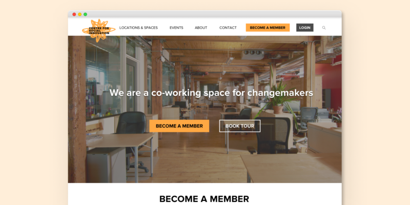
I worked on cleaning up the top navigation which was key to optimization for this specific website. Originally, there were a lot of unclear and ambiguous nav labels which created scattering; the CTA wasn’t consistent nor impactful; there are pages you can only access through the footer (after scrolling a very long page); and the page sections didn’t reflect what users commonly use the website for. Utilizing this method — that is, making impactful tweaks is more realistic and effective way to improve the UX of a website (rather than redesigning from scratch).
This was a solo project where I conducted research, planning, design, and A/B testing. The original web page vs. optimized versions are below.

Problem:

To start, I needed to gain more insight into the users and organization to identify their goals. Through three methods (my own social network; looking at other co-working spaces; and contacting CSI directly), I was able to come up the top goals/needs for the website for both users and organization.
There are numerous issues on the existing website, especially redundancy and ambiguity in the top nav bar (information architecture), weak hero area/CTA, ordering of the sections on the page, language, footer, a very long page, and not having certain sections that reflect what users are most commonly visiting the website for. For full annotated issues, see the full case study.
Solution:
Several iterations of the optimized version as well as working the information architecture (IA) of the top nav bar.
I focused largely on the top navigation/IA of how the pages were organized to minimize scatter lost to ambiguous and redundant top nav labelling. This was done by condensing the number of categories, as well as renaming some of them. For example “Culture” was originally used for essentially their About page.
I also made the primary CTA more consistent through impactful language. “Become a Member” became consistently used. It’s clear, direct, and to-the-point. I also added a complementary secondary CTA (“Book a Tour”) which is typical of co-working site, yet was buried deep into the existing CSI website. Through my changes, I was about to shorten the overall page length by removing some of the content for content based on top content that users commonly go to the website for and organizational goals (e.g., booking space, and events) to reduce cognitive load.
For full annotations of my fixes, see the full case study here.


Over a period of a few days, the original and my final optimized version were A/B tested. Four tasks were given and data was collected for (Task Completion) “Success Rate” and “Time on Task” to Complete Tasks.
Tasks
1. You’re interested in finding out the pricing options for a workspace — where would you click to find this? (pricing)
2. You heard the Centre of Social Innovation is hosting the Toronto Storytelling Festival and you want to check it out, where would you go to find out more details? (events)
3. You’re an existing member of the Centre for Social Innovation. Where would you go to change your home address online? (intranet)
4. Without using the Search function, you’d like to see what organizations have set up offices at the Centre of Social Innovation, where would you go? (members list)
Outcome:
My optimized design was able to increase the success rate by 35% and the time on task was 42% faster.


